Python Matplotlib Stackplot Transparency
Python Matplotlib Stackplot Transparency
Transparency in stack plots allows overlapping layers to be visualized more clearly, providing better insights into your data. In Matplotlib, you can control the transparency of stack plots using the alpha parameter.
This tutorial covers:
- Applying transparency to stack plots.
- Using different transparency levels for datasets.
Basic Stack Plot with Transparency
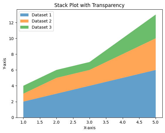
The alpha parameter controls the transparency of the stack plot. The value ranges from 0 (completely transparent) to 1 (fully opaque).
Example 1: Basic Stack Plot with Transparency
import matplotlib.pyplot as plt

# Data for the stack plot
x = [1, 2, 3, 4, 5]
y1 = [2, 3, 4, 5, 6]
y2 = [1, 2, 2, 3, 4]
y3 = [1, 1, 1, 2, 3]

# Create a stack plot with transparency
plt.stackplot(x, y1, y2, y3, labels=['Dataset 1', 'Dataset 2', 'Dataset 3'], alpha=0.7)

# Add labels and title
plt.xlabel('X-axis')
plt.ylabel('Y-axis')
plt.title('Stack Plot with Transparency')

# Add a legend
plt.legend(loc='upper left')

# Show the plot
plt.show()
Explanation
- The
alphaparameter is set to 0.7, making the layers semi-transparent. - This allows overlapping areas to be seen more clearly.

Applying Different Transparency Levels
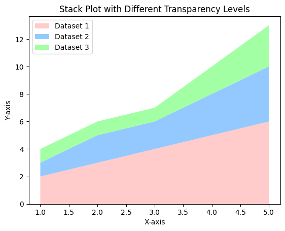
You can vary the transparency for each dataset in the stack plot by defining custom transparency values.
Example 2: Stack Plot with Different Transparency Levels
import matplotlib.pyplot as plt

# Data for the stack plot
x = [1, 2, 3, 4, 5]
y1 = [2, 3, 4, 5, 6]
y2 = [1, 2, 2, 3, 4]
y3 = [1, 1, 1, 2, 3]

# Transparency levels for each dataset
alphas = [0.5, 0.7, 0.9]

# Create a stack plot with varying transparency levels
plt.stackplot(x, y1, y2, y3, labels=['Dataset 1', 'Dataset 2', 'Dataset 3'],
              alpha=None, colors=['#ff9999', '#66b3ff', '#99ff99'])
for i, patch in enumerate(plt.gca().collections):
    patch.set_alpha(alphas[i])

# Add labels and title
plt.xlabel('X-axis')
plt.ylabel('Y-axis')
plt.title('Stack Plot with Different Transparency Levels')

# Add a legend
plt.legend(loc='upper left')

# Show the plot
plt.show()
Explanation
- A list of transparency levels is defined as
alphas. - The transparency of each dataset is applied individually using
set_alpha.

Combining Transparency with Custom Colors
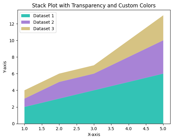
Transparency can be combined with custom colors for enhanced visual appeal.
Example 3: Stack Plot with Transparency and Custom Colors
import matplotlib.pyplot as plt

# Data for the stack plot
x = [1, 2, 3, 4, 5]
y1 = [2, 3, 4, 5, 6]
y2 = [1, 2, 2, 3, 4]
y3 = [1, 1, 1, 2, 3]

# Custom colors and transparency
colors = ['#00b5a3', '#9364cc', '#ccb464']
alpha = 0.6

# Create a stack plot with custom colors and transparency
plt.stackplot(x, y1, y2, y3, labels=['Dataset 1', 'Dataset 2', 'Dataset 3'],
              colors=colors, alpha=alpha)

# Add labels and title
plt.xlabel('X-axis')
plt.ylabel('Y-axis')
plt.title('Stack Plot with Transparency and Custom Colors')

# Add a legend
plt.legend(loc='upper left')

# Show the plot
plt.show()
Explanation
- The
colorsparameter defines custom colors for each dataset. - The
alphaparameter ensures a consistent transparency level for all datasets.

Summary
In this tutorial, we explored:
- How to apply transparency to stack plots using the
alphaparameter. - Adjusting transparency levels for individual datasets.
- Combining transparency with custom colors for better visualization.
By incorporating transparency into your stack plots, you can create more visually appealing and informative visualizations.