Python Matplotlib Stackplot Example
Python Matplotlib Stackplot Example
Stack plots are a type of area plot that show how multiple data series contribute to a whole over time or another continuous variable. They are useful for visualizing cumulative trends.
In this tutorial, we will cover:
- How to create a basic stack plot.
- Customizing colors and labels for clarity.
- Adding a legend and styling the plot.
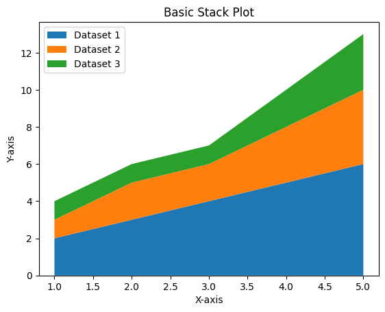
Creating a Basic Stack Plot
A stack plot can be created using the stackplot() function in Matplotlib.
Example 1: Basic Stack Plot
import matplotlib.pyplot as plt

# Data for the stack plot
x = [1, 2, 3, 4, 5]
y1 = [2, 3, 4, 5, 6]
y2 = [1, 2, 2, 3, 4]
y3 = [1, 1, 1, 2, 3]

# Create a stack plot
plt.stackplot(x, y1, y2, y3, labels=['Dataset 1', 'Dataset 2', 'Dataset 3'])

# Add labels and title
plt.xlabel('X-axis')
plt.ylabel('Y-axis')
plt.title('Basic Stack Plot')

# Add a legend
plt.legend(loc='upper left')

# Show the plot
plt.show()
Explanation
- The
stackplot()function is used to create the stack plot. The first argument is the x-axis data, followed by the y-axis data series. - The
labelsparameter assigns labels to each data series for the legend. - The
legend()function adds a legend to the plot for better readability.
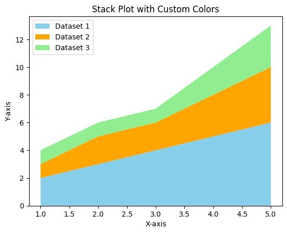
Customizing Stack Plot Colors and Labels
You can specify custom colors for each data series in a stack plot for better visualization.
Example 2: Stack Plot with Custom Colors
import matplotlib.pyplot as plt

# Data for the stack plot
x = [1, 2, 3, 4, 5]
y1 = [2, 3, 4, 5, 6]
y2 = [1, 2, 2, 3, 4]
y3 = [1, 1, 1, 2, 3]

# Define custom colors
colors = ['skyblue', 'orange', 'lightgreen']

# Create a stack plot with custom colors
plt.stackplot(x, y1, y2, y3, colors=colors, labels=['Dataset 1', 'Dataset 2', 'Dataset 3'])

# Add labels and title
plt.xlabel('X-axis')
plt.ylabel('Y-axis')
plt.title('Stack Plot with Custom Colors')

# Add a legend
plt.legend(loc='upper left')

# Show the plot
plt.show()
Explanation
- The
colorsparameter is used to specify custom colors for each data series in the stack plot. - Custom colors help to distinguish between the datasets more effectively.
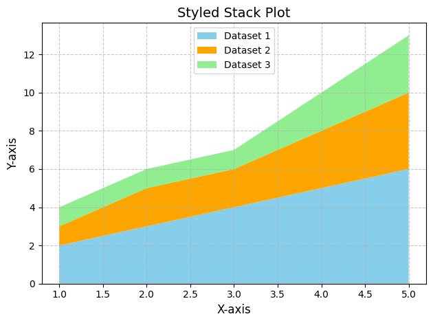
Adding Style to the Stack Plot
You can further customize the stack plot by adding grid lines, adjusting font sizes, and positioning the legend outside the plot area.
Example 3: Styled Stack Plot
import matplotlib.pyplot as plt

# Data for the stack plot
x = [1, 2, 3, 4, 5]
y1 = [2, 3, 4, 5, 6]
y2 = [1, 2, 2, 3, 4]
y3 = [1, 1, 1, 2, 3]

# Define custom colors
colors = ['skyblue', 'orange', 'lightgreen']

# Create a stack plot
plt.stackplot(x, y1, y2, y3, colors=colors, labels=['Dataset 1', 'Dataset 2', 'Dataset 3'])

# Add labels and title
plt.xlabel('X-axis', fontsize=12)
plt.ylabel('Y-axis', fontsize=12)
plt.title('Styled Stack Plot', fontsize=14)

# Add grid lines
plt.grid(True, linestyle='--', alpha=0.7)

# Add a legend outside the plot
plt.legend(loc='upper center')

# Adjust layout
plt.tight_layout()

# Show the plot
plt.show()
Explanation
- The
grid()function adds grid lines to the plot, improving visual alignment. - The
legend()function places the legend on the upper center area of plot. - The
tight_layout()function adjusts the spacing to ensure that all elements fit within the plot area.
Summary
In this tutorial, we explored:
- How to create a basic stack plot using Matplotlib.
- Customizing stack plot colors for better distinction between datasets.
- Styling the stack plot with grid lines, legends, and layout adjustments.
Stack plots are a powerful way to visualize cumulative data trends over a continuous variable. By customizing colors, labels, and styles, you can create informative and visually appealing plots.