Python Matplotlib Stackplot Colors
Python Matplotlib Stackplot Colors
Colors play a vital role in data visualization, helping to distinguish between datasets and enhancing the plot's overall readability. In Matplotlib, stack plots can be customized with a variety of color options to make your data visually appealing and easy to understand.
This tutorial covers:
- Using default colors in stack plots.
- Applying custom colors to datasets.
- Using a colormap for gradient effects.
Default Colors in Stack Plots
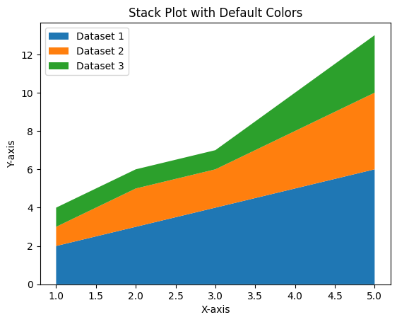
Matplotlib automatically assigns default colors to datasets in a stack plot if no custom colors are specified.
Example 1: Stack Plot with Default Colors
import matplotlib.pyplot as plt

# Data for the stack plot
x = [1, 2, 3, 4, 5]
y1 = [2, 3, 4, 5, 6]
y2 = [1, 2, 2, 3, 4]
y3 = [1, 1, 1, 2, 3]

# Create a stack plot
plt.stackplot(x, y1, y2, y3, labels=['Dataset 1', 'Dataset 2', 'Dataset 3'])

# Add labels and title
plt.xlabel('X-axis')
plt.ylabel('Y-axis')
plt.title('Stack Plot with Default Colors')

# Add a legend
plt.legend(loc='upper left')

# Show the plot
plt.show()
Explanation
- Matplotlib automatically assigns different colors to each dataset in the stack plot.
- The
labelsparameter is used to identify each dataset in the legend.

Custom Colors in Stack Plots
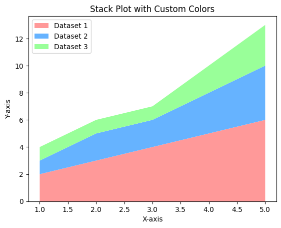
You can define your own color scheme by specifying a list of colors for the stack plot.
Example 2: Stack Plot with Custom Colors
import matplotlib.pyplot as plt

# Data for the stack plot
x = [1, 2, 3, 4, 5]
y1 = [2, 3, 4, 5, 6]
y2 = [1, 2, 2, 3, 4]
y3 = [1, 1, 1, 2, 3]

# Define custom colors
colors = ['#ff9999', '#66b3ff', '#99ff99']

# Create a stack plot with custom colors
plt.stackplot(x, y1, y2, y3, colors=colors, labels=['Dataset 1', 'Dataset 2', 'Dataset 3'])

# Add labels and title
plt.xlabel('X-axis')
plt.ylabel('Y-axis')
plt.title('Stack Plot with Custom Colors')

# Add a legend
plt.legend(loc='upper left')

# Show the plot
plt.show()
Explanation
- The
colorsparameter is used to specify a list of custom colors for the datasets. - Each color in the list corresponds to a dataset in the stack plot.

Using a Colormap for Gradient Effects
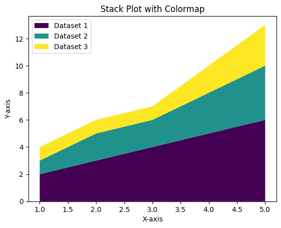
Colormaps can be used to apply gradient effects to stack plots, especially when dealing with a large number of datasets.
Example 3: Stack Plot with Colormap
import matplotlib.pyplot as plt
from matplotlib import cm

# Data for the stack plot
x = [1, 2, 3, 4, 5]
y1 = [2, 3, 4, 5, 6]
y2 = [1, 2, 2, 3, 4]
y3 = [1, 1, 1, 2, 3]

data = [y1, y2, y3]

# Define a colormap
colormap = cm.get_cmap('viridis', len(data))
colors = colormap(range(len(data)))

# Create a stack plot with colormap
plt.stackplot(x, *data, colors=colors, labels=['Dataset 1', 'Dataset 2', 'Dataset 3'])

# Add labels and title
plt.xlabel('X-axis')
plt.ylabel('Y-axis')
plt.title('Stack Plot with Colormap')

# Add a legend
plt.legend(loc='upper left')

# Show the plot
plt.show()
Explanation
- The
cm.get_cmap()function retrieves a colormap, and the number of colors is set to match the number of datasets. - Each dataset is assigned a unique color from the colormap, creating a gradient effect.

Summary
In this tutorial, we explored:
- Using default colors in Matplotlib stack plots.
- Customizing stack plots with user-defined colors.
- Applying colormaps for gradient effects in stack plots.
By customizing colors in stack plots, you can enhance the clarity and aesthetics of your visualizations, making them more effective and engaging.