Python Matplotlib Scatter Plot with Specific Colors for Markers
Customizing Marker Colors in Matplotlib Scatter Plots
In Matplotlib, you can create highly customized scatter plots, including setting specific colors for each marker. This feature is useful for visualizing datasets with categories, gradients, or any custom styling needs. This tutorial demonstrates how to achieve this step by step.
Using the color Parameter
The color parameter in plt.scatter() allows you to specify a list of colors for each marker. Colors can be defined using:
- Named colors (e.g., 'red', 'blue')
- Hex codes (e.g., '#FF5733')
- RGB tuples (e.g., (0.5, 0.2, 0.8))
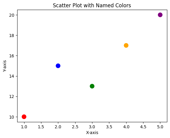
Example 1: Scatter Plot with Named Colors
import matplotlib.pyplot as plt

# Data points
x = [1, 2, 3, 4, 5]
y = [10, 15, 13, 17, 20]
colors = ['red', 'blue', 'green', 'orange', 'purple']

# Create scatter plot
plt.scatter(x, y, color=colors, s=100)

# Add labels and title
plt.xlabel('X-axis')
plt.ylabel('Y-axis')
plt.title('Scatter Plot with Named Colors')

# Show plot
plt.show()
Explanation
- Each marker's color is set by the corresponding entry in the
colorslist. - The
s=100argument adjusts marker size for better visibility.

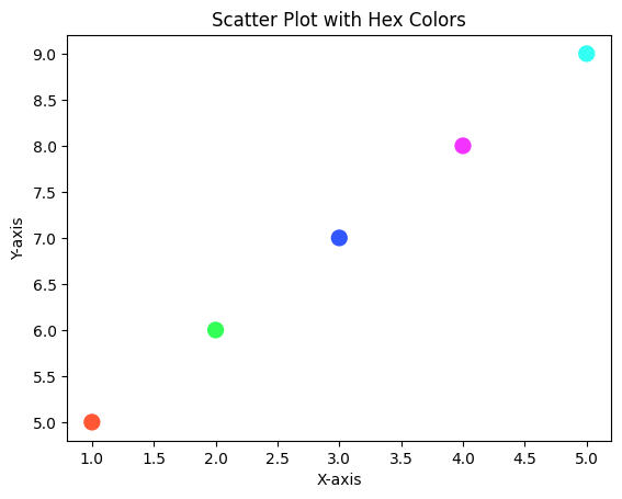
Example 2: Scatter Plot with Hex Codes
import matplotlib.pyplot as plt

# Data points
x = [1, 2, 3, 4, 5]
y = [5, 6, 7, 8, 9]
colors = ['#FF5733', '#33FF57', '#3357FF', '#F333FF', '#33FFF3']

# Create scatter plot
plt.scatter(x, y, color=colors, s=100)

# Add labels and title
plt.xlabel('X-axis')
plt.ylabel('Y-axis')
plt.title('Scatter Plot with Hex Colors')

# Show plot
plt.show()
Explanation
- Colors are defined using hex codes for precise customization.
- Each marker has a unique appearance based on its corresponding hex code.

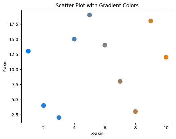
Example 3: Scatter Plot with Gradient Colors
Using RGB tuples, you can create gradient-like effects.
import matplotlib.pyplot as plt
import numpy as np

# Data points
x = np.arange(1, 11)
y = np.random.randint(1, 20, size=10)
colors = [(i/10, 0.5, 1-i/10) for i in range(len(x))]

# Create scatter plot
plt.scatter(x, y, color=colors, s=100)

# Add labels and title
plt.xlabel('X-axis')
plt.ylabel('Y-axis')
plt.title('Scatter Plot with Gradient Colors')

# Show plot
plt.show()
Explanation
- RGB tuples dynamically calculate colors based on data indices.
- The gradient effect provides a smooth transition between colors.

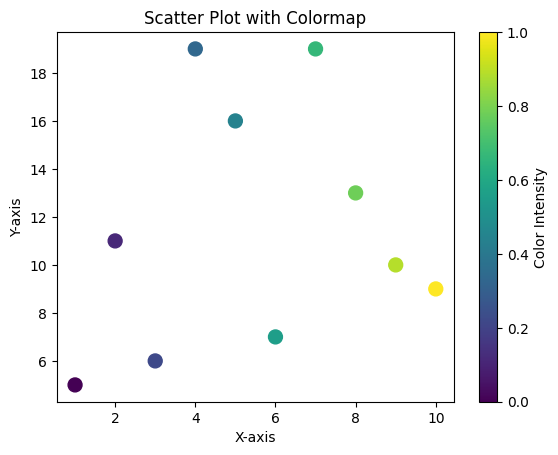
Example 4: Scatter Plot with a Colormap
You can also use Matplotlib’s built-in colormaps for automatic color assignment.
import matplotlib.pyplot as plt
import numpy as np

# Data points
x = np.arange(1, 11)
y = np.random.randint(1, 20, size=10)
colors = np.linspace(0, 1, len(x))

# Create scatter plot with colormap
plt.scatter(x, y, c=colors, cmap='viridis', s=100)

# Add labels and title
plt.xlabel('X-axis')
plt.ylabel('Y-axis')
plt.title('Scatter Plot with Colormap')

# Add colorbar
plt.colorbar(label='Color Intensity')

# Show plot
plt.show()
Explanation
- The
cparameter defines scalar values for color mapping. - A colormap (
cmap) maps these scalar values to colors. plt.colorbar()adds a color legend to the plot.

Summary
In this tutorial, you learned:
- How to set specific colors for each marker in a scatter plot.
- How to use named colors, hex codes, and RGB tuples for customization.
- How to leverage colormaps for dynamic color assignments.
By mastering these techniques, you can create visually appealing and informative scatter plots for any dataset.