Python Matplotlib - Adding a Title to a Pie Chart
Pie Chart Title in Matplotlib
Pie charts are a popular way to represent data proportions visually. Adding a title to your pie chart helps provide context and make your visualization more informative. In this tutorial, we'll demonstrate how to add a title to a pie chart using Python's Matplotlib library.
Basic Example: Adding a Title
The following example demonstrates how to create a pie chart and add a title:
import matplotlib.pyplot as plt

# Data for the pie chart
labels = ['Python', 'Java', 'C++', 'Ruby']
sizes = [45, 30, 15, 10]

# Create pie chart
plt.pie(sizes, labels=labels, autopct='%1.1f%%')

# Add title
plt.title('Programming Language Popularity')

# Show the plot
plt.show()
Explanation
- The
plt.pie()function is used to create the pie chart, withlabelsrepresenting the categories andsizesdefining their proportions. - The
autopctparameter formats the percentages displayed on the chart. - The
plt.title()function adds a title to the chart.

Customizing the Title
You can customize the title's font size, color, and alignment using additional parameters in the plt.title() function.
import matplotlib.pyplot as plt

# Data for the pie chart
labels = ['Python', 'Java', 'C++', 'Ruby']
sizes = [45, 30, 15, 10]

# Create pie chart
plt.pie(sizes, labels=labels, autopct='%1.1f%%')

# Add customized title
plt.title('Programming Language Popularity', fontsize=16, color='blue', loc='left')

# Show the plot
plt.show()
Explanation
fontsize: Sets the font size of the title (e.g.,16).color: Changes the title's color (e.g.,'blue').loc: Adjusts the title's alignment (options include'left','center', and'right').

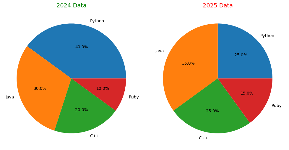
Example: Multiple Pie Charts with Titles
This example shows how to add titles to multiple pie charts in a single figure:
import matplotlib.pyplot as plt

# Data for the pie charts
labels = ['Python', 'Java', 'C++', 'Ruby']
sizes1 = [40, 30, 20, 10]
sizes2 = [25, 35, 25, 15]

# Create a figure with two subplots
fig, axes = plt.subplots(1, 2, figsize=(10, 5))

# First pie chart
axes[0].pie(sizes1, labels=labels, autopct='%1.1f%%')
axes[0].set_title('2024 Data', fontsize=14, color='green')

# Second pie chart
axes[1].pie(sizes2, labels=labels, autopct='%1.1f%%')
axes[1].set_title('2025 Data', fontsize=14, color='red')

# Show the plots
plt.tight_layout()
plt.show()
Explanation
- The
plt.subplots()function creates a figure with two subplots arranged side-by-side. - Each pie chart is plotted using the
axes[i].pie()method, whereiis the index of the subplot. - The
set_title()method is used to add titles to individual subplots.

Summary
In this tutorial, we covered:
- How to add a title to a pie chart using
plt.title(). - Customization options for title appearance, such as font size, color, and alignment.
- Adding titles to multiple pie charts in a single figure.
With these techniques, you can create more informative and visually appealing pie charts in Python Matplotlib.