Python Matplotlib - Pie Chart from Pandas DataFrame
Python Matplotlib - Pie Chart from Pandas DataFrame
Creating a pie chart from a Pandas DataFrame is a common task for visualizing categorical data. In this tutorial, we'll show you how to plot a pie chart using data stored in a Pandas DataFrame with Matplotlib. You'll learn how to prepare the data, create the plot, and customize it to make your chart more insightful.
Prerequisites
To follow along with this tutorial, you'll need to have the following libraries installed:
- Matplotlib: For plotting the pie chart.
- Pandas: For creating and managing the DataFrame.
You can install these libraries via pip if you don't have them installed already:
pip install matplotlib pandas
Step 1: Prepare the Data
In order to create a pie chart, you'll first need to have your data in a Pandas DataFrame. Let's assume we have a DataFrame with some categorical data, such as sales in different regions.
Example: Creating a Pandas DataFrame
import pandas as pd

# Creating a Pandas DataFrame
data = {'Region': ['North', 'South', 'East', 'West'], 'Sales': [500, 300, 200, 400]}
df = pd.DataFrame(data)

# Display the DataFrame
print(df)
Explanation
- We created a DataFrame
dfcontaining two columns:RegionandSales. - This DataFrame represents sales data across four regions.
Step 2: Plotting the Pie Chart
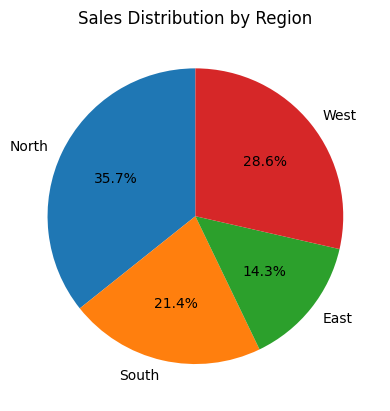
Now that we have our data ready, we can use Matplotlib to create a pie chart based on the sales in each region.
Example: Plotting the Pie Chart
import pandas as pd
import matplotlib.pyplot as plt

# Creating a DataFrame
data = {'Region': ['North', 'South', 'East', 'West'], 'Sales': [500, 300, 200, 400]}
df = pd.DataFrame(data)

# Plotting the pie chart from the DataFrame
plt.pie(df['Sales'], labels=df['Region'], autopct='%1.1f%%', startangle=90)

# Adding a title
plt.title('Sales Distribution by Region')

# Display the plot
plt.show()
Explanation
- We used the
plt.pie()function, wheredf['Sales']is the data used for the pie chart anddf['Region']provides the labels for each slice. - The
autopct='%1.1f%%'parameter formats the labels to show the percentage for each slice. startangle=90rotates the pie chart to start from the top, making it visually appealing.

Step 3: Customizing the Pie Chart
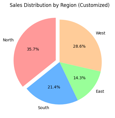
Matplotlib provides several options to customize the appearance of the pie chart. You can adjust the colors, explode specific slices, or change the font size for labels.
Example: Customizing the Pie Chart
import pandas as pd
import matplotlib.pyplot as plt

# Creating a DataFrame
data = {'Region': ['North', 'South', 'East', 'West'], 'Sales': [500, 300, 200, 400]}
df = pd.DataFrame(data)

# Customizing the pie chart
colors = ['#ff9999','#66b3ff','#99ff99','#ffcc99']
plt.pie(df['Sales'], labels=df['Region'], autopct='%1.1f%%', startangle=90, colors=colors, explode=(0.1, 0, 0, 0))

# Adding a title
plt.title('Sales Distribution by Region (Customized)')

# Display the plot
plt.show()
Explanation
- We defined a
colorslist to set custom colors for each slice. - The
explodeparameter pulls the first slice (North) out slightly to make it stand out. - Customizations like these can make your pie chart visually appealing and easier to understand.

Example: Using a DataFrame with Percentage Column
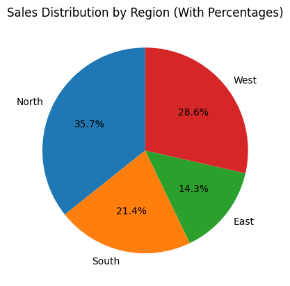
If you already have a percentage column in your DataFrame, you can plot a pie chart directly from that data.
Example
import pandas as pd
import matplotlib.pyplot as plt

# DataFrame with percentage column
data = {'Region': ['North', 'South', 'East', 'West'], 'Sales': [500, 300, 200, 400], 'Percentage': [35, 21, 14, 28]}
df = pd.DataFrame(data)

# Plotting pie chart using percentage column
plt.pie(df['Percentage'], labels=df['Region'], autopct='%1.1f%%', startangle=90)

# Adding title
plt.title('Sales Distribution by Region (With Percentages)')

# Display the plot
plt.show()
Explanation
- In this case, we directly used the
Percentagecolumn from the DataFrame to plot the pie chart. - Using percentages instead of absolute values might be more appropriate when the data is already normalized.

Summary
In this tutorial, we learned how to:
- Create a pie chart from a Pandas DataFrame using Matplotlib.
- Customize the pie chart with colors, exploding slices, and percentage labels.
- Use percentage columns in the DataFrame directly for plotting.
By using Pandas and Matplotlib together, you can easily visualize categorical data and make your analysis more insightful and effective.