Python Matplotlib - Pie Chart autopct()
Python Matplotlib - Pie Chart autopct
The autopct parameter in Matplotlib’s pie chart function allows you to display percentage values on the pie chart slices. It's a useful tool when visualizing proportions of data, providing an immediate understanding of each slice's contribution to the whole. The autopct can be customized to format the percentages, show actual values, or display both in various ways.
Using autopct to Display Percentages
The autopct parameter in the plt.pie() function allows you to display the percentage of each slice in a pie chart. You can pass a string format or a function to customize how the percentages are displayed.
Example 1: Basic autopct for Percentages
import matplotlib.pyplot as plt

# Data for the pie chart
labels = ['Python', 'Java', 'C++', 'Ruby']
sizes = [40, 30, 20, 10]

# Create pie chart with autopct to display percentages
plt.pie(sizes, labels=labels, autopct='%1.1f%%')

# Add title
plt.title('Programming Language Popularity')

# Show the plot
plt.show()
Explanation
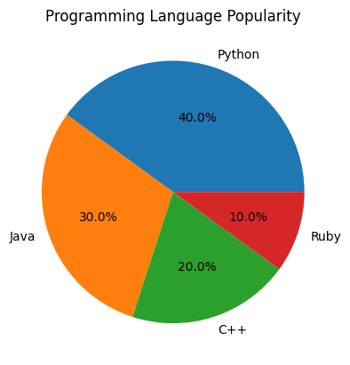
- We use the string format
%1.1f%%to display the percentage value with one decimal point and a percentage sign. - The
autopctargument formats the percentage for each slice based on its proportion to the total. - The pie chart shows only the percentages without any additional information.

Customizing the Display of Percentages and Values
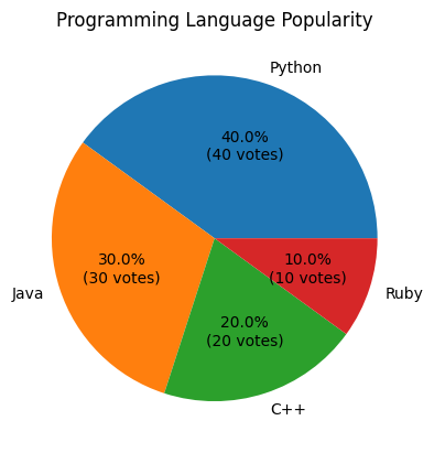
You can also display both the percentage and the absolute value (or count) in the pie chart slices by using a custom function with autopct.
Example 2: Display Percentage and Absolute Value
import matplotlib.pyplot as plt

# Data for the pie chart
labels = ['Python', 'Java', 'C++', 'Ruby']
sizes = [40, 30, 20, 10]

def format_pie(pct, all_vals):
    absolute = int(round(pct/100.0 * sum(all_vals)))
    return f"{pct:.1f}%\n({absolute} votes)"

# Create pie chart with percentage and absolute value
plt.pie(sizes, labels=labels, autopct=lambda pct: format_pie(pct, sizes))

# Add title
plt.title('Programming Language Popularity')

# Show the plot
plt.show()
Explanation
- The
format_piefunction takes the percentage and the total values (in this case, thesizes) and calculates the absolute value. - The lambda function inside
autopctcallsformat_pieto display both the percentage and the corresponding value. - The pie chart now shows both the percentage and the actual value (in votes) for each slice.

Using autopct with Formatting for Better Visual Appeal
Matplotlib allows further customization, such as adjusting the font size, color, and style of the text displayed for the percentage or values.
Example 3: Customizing the Text Formatting of Percentages
import matplotlib.pyplot as plt

# Data for the pie chart
labels = ['Python', 'Java', 'C++', 'Ruby']
sizes = [40, 30, 20, 10]

def format_pie(pct, all_vals):
    absolute = int(round(pct/100.0 * sum(all_vals)))
    return f"{pct:.1f}%\n({absolute} votes)"

# Create pie chart with customized text appearance
plt.pie(sizes, labels=labels, autopct=lambda pct: format_pie(pct, sizes),
        textprops={'fontsize': 14, 'color': 'purple', 'fontweight': 'bold'})

# Add title
plt.title('Programming Language Popularity')

# Show the plot
plt.show()
Explanation
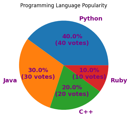
- The
textpropsparameter customizes the font size, color, and weight of the text displayed for each slice. - In this case, we used a larger font size (14), purple color, and bold weight for the text to improve visibility and make it more visually appealing.
- The text formatting makes the percentages and values easier to read, especially in a presentation or report setting.

Displaying Rounded Percentages
Sometimes you may want to round the percentages to a specific number of decimal places for cleaner presentation.
Example 4: Rounding Percentages to Integer
import matplotlib.pyplot as plt

# Data for the pie chart
labels = ['Python', 'Java', 'C++', 'Ruby']
sizes = [40, 30, 20, 10]

# Create pie chart with rounded percentage values
plt.pie(sizes, labels=labels, autopct='%1.0f%%')

# Add title
plt.title('Programming Language Popularity')

# Show the plot
plt.show()
Explanation
- We used
%1.0f%%as the format string to display the percentages rounded to the nearest integer. - This is useful when you don’t want decimal points cluttering the chart and want a more general overview of the data distribution.
- The pie chart now shows only whole numbers as percentages.

Handling Special Cases for autopct
In some cases, you might want to handle specific situations, such as showing empty slices as blank or displaying custom values for certain categories.
Example 5: Handle Empty Slices
import matplotlib.pyplot as plt

# Data for the pie chart
labels = ['Python', 'Java', 'C++', 'Ruby']
sizes = [40, 0, 20, 40]

# Create pie chart and handle empty slices
def handle_zero_pct(pct, all_vals):
    if pct == 0:
        return ""  # Empty slice should have no text
    return f"{pct:.1f}%"

plt.pie(sizes, labels=labels, autopct=lambda pct: handle_zero_pct(pct, sizes))

# Add title
plt.title('Programming Language Popularity')

# Show the plot
plt.show()
Explanation
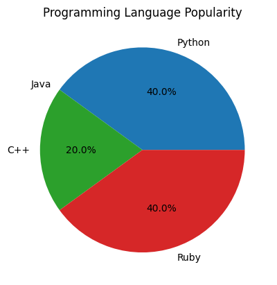
- In this case,
handle_zero_pctchecks if the percentage is 0 and removes the text for that slice, making it blank. - This is useful when you have empty or negligible categories in the data.
- Now, the pie chart only shows percentages for slices that have non-zero values.

Summary
In this tutorial, we covered the following:
- How to use the
autopctparameter to display percentages in pie charts. - How to customize the display of percentages and absolute values using a custom function.
- Formatting options for text customization such as font size, color, and style.
- Handling special cases, such as rounding percentages or ignoring empty slices.
By using the autopct parameter effectively, you can create informative and visually appealing pie charts that convey both percentages and values clearly, helping to improve the overall presentation of your data.