Python Matplotlib - Creating Multiple Scatter Plots in the Same Figure
Multiple Scatter Plots in Matplotlib
When visualizing relationships between multiple datasets, plotting multiple scatter plots in the same figure can be very useful. Python's Matplotlib library provides an easy way to achieve this using the plt.scatter() function, combined with customizable markers, colors, and labels.
Example 1: Two Scatter Plots
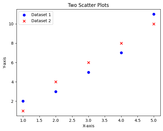
This example shows how to plot two scatter plots in the same figure:
import matplotlib.pyplot as plt

# Data for the first scatter plot
x1 = [1, 2, 3, 4, 5]
y1 = [2, 3, 5, 7, 11]

# Data for the second scatter plot
x2 = [1, 2, 3, 4, 5]
y2 = [1, 4, 6, 8, 10]

# Create scatter plots
plt.scatter(x1, y1, color='blue', label='Dataset 1', marker='o')
plt.scatter(x2, y2, color='red', label='Dataset 2', marker='x')

# Add labels and title
plt.xlabel('X-axis')
plt.ylabel('Y-axis')
plt.title('Two Scatter Plots')

# Add legend
plt.legend()

# Show plot
plt.show()
Explanation
- The
plt.scatter()function is called twice, once for each dataset. - Different
colorandmarkerparameters distinguish the datasets. - The
plt.legend()function is used to identify the datasets.

Example 2: More Than Two Scatter Plots
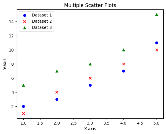
This example demonstrates how to plot three scatter plots in the same figure:
import matplotlib.pyplot as plt

# Data for three scatter plots
x1 = [1, 2, 3, 4, 5]
y1 = [2, 3, 5, 7, 11]
x2 = [1, 2, 3, 4, 5]
y2 = [1, 4, 6, 8, 10]
x3 = [1, 2, 3, 4, 5]
y3 = [5, 7, 8, 10, 15]

# Create scatter plots
plt.scatter(x1, y1, color='blue', label='Dataset 1', marker='o')
plt.scatter(x2, y2, color='red', label='Dataset 2', marker='x')
plt.scatter(x3, y3, color='green', label='Dataset 3', marker='^')

# Add labels and title
plt.xlabel('X-axis')
plt.ylabel('Y-axis')
plt.title('Multiple Scatter Plots')

# Add legend
plt.legend()

# Show plot
plt.show()
Explanation
- Three scatter plots are created by calling
plt.scatter()three times. - Each dataset is assigned a unique
colorandmarkerto make it distinguishable. - The legend is automatically updated to reflect all three datasets.

Customization Tips
You can further customize these scatter plots by adjusting marker sizes, transparencies, or adding gridlines:
- Use the
sparameter to control marker size. - Set the
alphaparameter for transparency. - Add gridlines with
plt.grid(True).
Summary
In this tutorial, we covered:
- How to create multiple scatter plots in the same figure.
- How to customize their appearance using colors, markers, and legends.
- Examples for both two and more than two scatter plots.
With these techniques, you can effectively visualize and compare multiple datasets in Python using Matplotlib.