Python Matplotlib - Horizontal Bar Plots
Python Matplotlib - Horizontal Bar Plots
Horizontal bar plots are useful for visualizing data where the category names are long, or when you want to focus on the comparison between values. Matplotlib provides an easy way to create horizontal bar plots using the barh() function.
- How to create a basic horizontal bar plot.
- Customizing the appearance of horizontal bar plots.
- Additional enhancements for horizontal bar plots.
Creating a Basic Horizontal Bar Plot
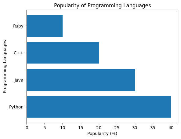
The barh() function in Matplotlib is used to create horizontal bar plots. The categories are plotted on the y-axis, and the values are plotted on the x-axis.
Example 1: Basic Horizontal Bar Plot
import matplotlib.pyplot as plt

# Data for the bar plot
categories = ['Python', 'Java', 'C++', 'Ruby']
values = [40, 30, 20, 10]

# Create horizontal bar plot
plt.barh(categories, values)

# Add labels and title
plt.xlabel('Popularity (%)')
plt.ylabel('Programming Languages')
plt.title('Popularity of Programming Languages')

# Show the plot
plt.show()
Explanation
- The
barh()function is used to create the horizontal bar plot. - The
categorieslist is plotted along the y-axis, and thevalueslist is plotted along the x-axis. - Labels and a title are added to improve clarity.

Customizing the Horizontal Bar Plot
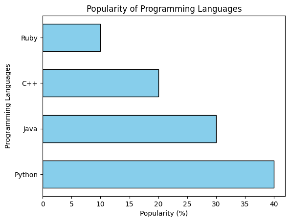
You can further customize the appearance of the horizontal bar plot, such as changing the color, width, and adding gridlines.
Example 2: Customized Horizontal Bar Plot
import matplotlib.pyplot as plt

# Data for the bar plot
categories = ['Python', 'Java', 'C++', 'Ruby']
values = [40, 30, 20, 10]

# Create horizontal bar plot with customizations
plt.barh(categories, values, color='skyblue', edgecolor='black', height=0.6)

# Add labels and title
plt.xlabel('Popularity (%)')
plt.ylabel('Programming Languages')
plt.title('Popularity of Programming Languages')

# Show the plot
plt.show()
Explanation
- The
colorparameter is set to 'skyblue' to change the color of the bars. - The
edgecolorparameter adds black borders to the bars, enhancing the visual appeal. - The
heightparameter adjusts the thickness of the bars.

Horizontal Bar Plot with Sorted Data
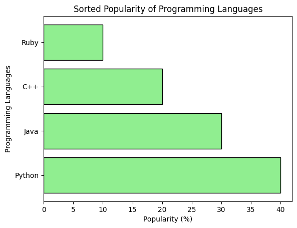
Sorting the data can make the bar plot easier to read, especially when comparing categories.
Example 3: Sorted Horizontal Bar Plot
import matplotlib.pyplot as plt

# Data for the bar plot
categories = ['Python', 'Java', 'C++', 'Ruby']
values = [40, 30, 20, 10]

# Sort the values and categories in descending order
sorted_values, sorted_categories = zip(*sorted(zip(values, categories), reverse=True))

# Create horizontal bar plot with sorted data
plt.barh(sorted_categories, sorted_values, color='lightgreen', edgecolor='black')

# Add labels and title
plt.xlabel('Popularity (%)')
plt.ylabel('Programming Languages')
plt.title('Sorted Popularity of Programming Languages')

# Show the plot
plt.show()
Explanation
- The
zip()function is used to pair the categories and values, andsorted()sorts the values in descending order. - The sorted values and categories are unpacked and used in the
barh()function to create the plot.

Summary
In this tutorial, we learned how to:
- Create a basic horizontal bar plot using
barh(). - Customize the appearance of horizontal bar plots by adjusting colors, borders, and bar height.
- Sort data and create sorted horizontal bar plots for better comparison.
Horizontal bar plots are effective for visualizing and comparing categories when the labels or categories are long, or when the data is better viewed in this format.