Python Matplotlib - Understanding and Using Colormaps
What Are Colormaps in Matplotlib?
A colormap in Matplotlib is a mapping of scalar data to colors. Colormaps are essential for creating visually engaging and meaningful data visualizations. They allow you to represent values as colors, which is particularly useful in scatter plots, heatmaps, and other data-intensive plots.
Key Features of Colormaps
- Matplotlib provides various colormaps, such as
viridis,plasma,coolwarm, andcividis. - Colormaps can be continuous or discrete.
- You can customize or reverse colormaps for specific needs.
Basic Usage of Colormaps
The cmap parameter is used to specify a colormap in Matplotlib plots.
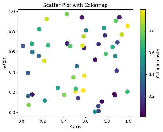
Example 1: Colormap in a Scatter Plot
import matplotlib.pyplot as plt
import numpy as np

# Data
x = np.random.rand(50)
y = np.random.rand(50)
z = np.random.rand(50)  # Scalar values for colors

# Create scatter plot with colormap
plt.scatter(x, y, c=z, cmap='viridis', s=100)

# Add colorbar
plt.colorbar(label='Color Intensity')

# Add labels and title
plt.xlabel('X-axis')
plt.ylabel('Y-axis')
plt.title('Scatter Plot with Colormap')

# Show plot
plt.show()
Explanation
c=zmaps the scalar values (z) to colors using theviridiscolormap.plt.colorbar()adds a legend to show the color-to-value mapping.

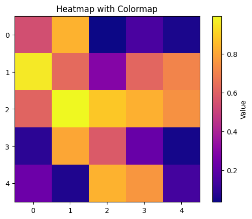
Example 2: Colormap in a Heatmap
import matplotlib.pyplot as plt
import numpy as np

# Data
matrix = np.random.rand(5, 5)

# Create heatmap with colormap
plt.imshow(matrix, cmap='plasma', interpolation='nearest')

# Add colorbar
plt.colorbar(label='Value')

# Add title
plt.title('Heatmap with Colormap')

# Show plot
plt.show()
Explanation
plt.imshow()visualizes the matrix as an image.- The
cmap='plasma'argument applies theplasmacolormap to the heatmap. - Values are mapped to colors using the colorbar.

Example 3: Reversing a Colormap
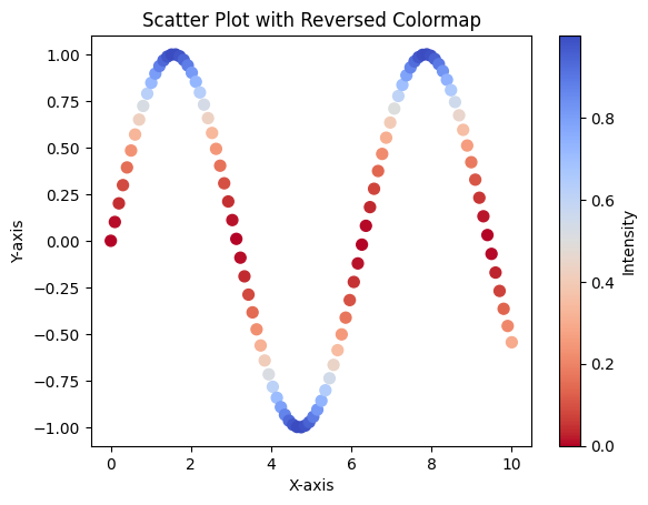
Sometimes, reversing a colormap can make data interpretation more intuitive.
import matplotlib.pyplot as plt
import numpy as np

# Data
x = np.linspace(0, 10, 100)
y = np.sin(x)
z = y ** 2

# Create line plot with reversed colormap
plt.scatter(x, y, c=z, cmap='coolwarm_r', s=50)

# Add colorbar
plt.colorbar(label='Intensity')

# Add labels and title
plt.xlabel('X-axis')
plt.ylabel('Y-axis')
plt.title('Scatter Plot with Reversed Colormap')

# Show plot
plt.show()
Explanation
- Reversed colormap is indicated by appending
_rto the colormap name. - This plot uses the reversed
coolwarmcolormap (coolwarm_r).

Summary
Colormaps are powerful tools for visualizing scalar data in Python Matplotlib. Key points covered include:
- Specifying colormaps using the
cmapparameter. - Applying colormaps in scatter plots and heatmaps.
- Reversing colormaps to suit visualization needs.
By understanding colormaps, you can create informative and visually appealing plots for your datasets.