Python Matplotlib - Adding and Customizing Color Bars
What is a Color Bar in Matplotlib?
A color bar in Matplotlib is a visual representation of the mapping between scalar values and colors in a plot. It helps interpret the color coding used in visualizations such as scatter plots, heatmaps, or contour plots. The plt.colorbar() function is used to add a color bar to a plot.
Basic Usage of Color Bars
Color bars are typically added to plots where a colormap is used. The following examples illustrate how to use color bars effectively in Matplotlib.
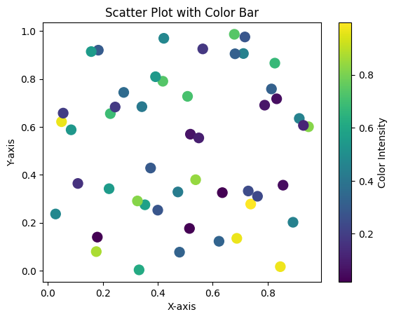
Example 1: Adding a Color Bar to a Scatter Plot
import matplotlib.pyplot as plt
import numpy as np

# Data
x = np.random.rand(50)
y = np.random.rand(50)
z = np.random.rand(50)  # Scalar values for color

# Scatter plot with colormap
plt.scatter(x, y, c=z, cmap='viridis', s=100)

# Add color bar
color_bar = plt.colorbar()
color_bar.set_label('Color Intensity')

# Add labels and title
plt.xlabel('X-axis')
plt.ylabel('Y-axis')
plt.title('Scatter Plot with Color Bar')

# Show plot
plt.show()
Explanation
- The
c=zargument maps the scalar values (z) to colors using theviridiscolormap. - The
plt.colorbar()function adds a color bar to the plot. color_bar.set_label()adds a label to the color bar for better interpretation.

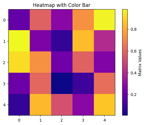
Example 2: Adding a Color Bar to a Heatmap
import matplotlib.pyplot as plt
import numpy as np

# Data
matrix = np.random.rand(5, 5)

# Heatmap with colormap
plt.imshow(matrix, cmap='plasma', interpolation='nearest')

# Add color bar
color_bar = plt.colorbar()
color_bar.set_label('Matrix Values')

# Add title
plt.title('Heatmap with Color Bar')

# Show plot
plt.show()
Explanation
- The
plt.imshow()function displays the matrix as an image with a colormap applied. - The
plt.colorbar()function adds a color bar, which maps matrix values to colors. color_bar.set_label()is used to label the color bar for clarity.

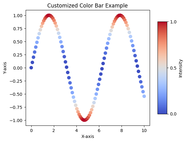
Example 3: Customizing the Color Bar
You can customize the color bar's size, location, and ticks using the matplotlib.colorbar.Colorbar object and additional parameters.
import matplotlib.pyplot as plt
import numpy as np

# Data
x = np.linspace(0, 10, 100)
y = np.sin(x)
z = y ** 2

# Scatter plot with colormap
scatter = plt.scatter(x, y, c=z, cmap='coolwarm', s=50)

# Add color bar
color_bar = plt.colorbar(scatter, shrink=0.8, aspect=10)
color_bar.set_label('Intensity')
color_bar.set_ticks([0.0, 0.5, 1.0])

# Add labels and title
plt.xlabel('X-axis')
plt.ylabel('Y-axis')
plt.title('Customized Color Bar Example')

# Show plot
plt.show()
Explanation
- The
shrinkparameter adjusts the size of the color bar. - The
aspectparameter controls the thickness of the color bar. color_bar.set_ticks()defines specific tick locations on the color bar for better readability.

Summary
In this tutorial, we explored:
- Adding a color bar to scatter plots and heatmaps using
plt.colorbar(). - Customizing the color bar's label, size, and ticks for enhanced visualization.
Color bars are indispensable for interpreting data visualizations that use colormaps, making them more informative and visually appealing.