Python Matplotlib - Bar Plot with Different Colors for Each Bar
Python Matplotlib - Bar Plot with Different Colors for Each Bar
In Matplotlib, customizing the colors of each bar in a bar plot can help emphasize individual data points and improve the visual appeal of your chart. In this tutorial, we'll explore how to assign different colors to each bar in a bar plot using Python's Matplotlib library.
- How to apply different colors to each bar.
- Using color maps to assign a range of colors to bars.
- Customizing colors manually for each bar.
Applying Different Colors to Each Bar
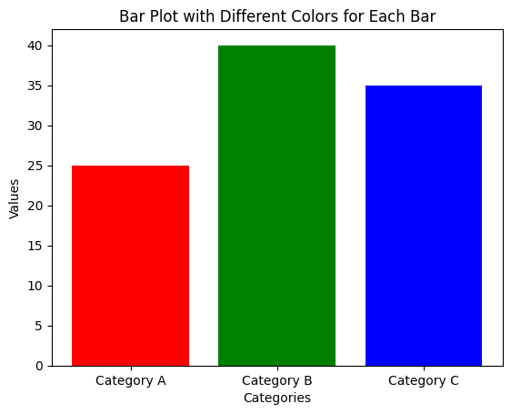
To assign different colors to each bar in a bar plot, you can pass a list of colors to the color parameter in plt.bar(). This list should match the number of bars in the plot.
Example 1: Basic Bar Plot with Different Colors for Each Bar
import matplotlib.pyplot as plt

# Data for the bar plot
categories = ['Category A', 'Category B', 'Category C']
values = [25, 40, 35]
colors = ['red', 'green', 'blue']  # Custom colors for each bar

# Create the bar plot with different colors for each bar
plt.bar(categories, values, color=colors)

# Add labels and title
plt.xlabel('Categories')
plt.ylabel('Values')
plt.title('Bar Plot with Different Colors for Each Bar')

# Show the plot
plt.show()
Explanation
- The
colorslist specifies a color for each bar in the plot. - The length of the color list matches the number of bars to ensure each bar has a distinct color.
- Labels and title are added to enhance the plot's readability.

Using Color Maps for Bar Colors
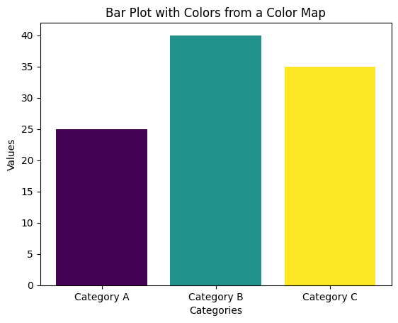
Instead of manually specifying colors, you can use a color map to automatically assign a range of colors to your bars. Matplotlib offers various color maps such as viridis, plasma, and others.
Example 2: Using a Color Map for Bar Colors
import matplotlib.pyplot as plt
import numpy as np

# Data for the bar plot
categories = ['Category A', 'Category B', 'Category C']
values = [25, 40, 35]

# Generate colors using a color map
colors = plt.cm.viridis(np.linspace(0, 1, len(values)))

# Create the bar plot with colors from the color map
plt.bar(categories, values, color=colors)

# Add labels and title
plt.xlabel('Categories')
plt.ylabel('Values')
plt.title('Bar Plot with Colors from a Color Map')

# Show the plot
plt.show()
Explanation
- The
plt.cm.viridiscolor map is used to generate colors. - The
np.linspace(0, 1, len(values))generates a range of values from 0 to 1, corresponding to the number of bars. - The colors are automatically assigned to the bars using the color map.

Customizing Colors Based on Values
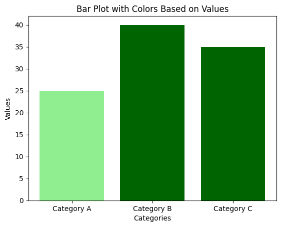
You can also assign colors based on the values of the bars to emphasize higher or lower values. For example, bars with higher values can be displayed in a different color to make them stand out.
Example 3: Assigning Colors Based on Values
import matplotlib.pyplot as plt

# Data for the bar plot
categories = ['Category A', 'Category B', 'Category C']
values = [25, 40, 35]

# Assign colors based on the value of each bar (higher values get darker color)
colors = ['darkgreen' if value > 30 else 'lightgreen' for value in values]

# Create the bar plot with customized colors
plt.bar(categories, values, color=colors)

# Add labels and title
plt.xlabel('Categories')
plt.ylabel('Values')
plt.title('Bar Plot with Colors Based on Values')

# Show the plot
plt.show()
Explanation
- A list comprehension is used to assign a color based on the value of each bar.
- Bars with values greater than 30 are assigned a darker green color, while others are assigned a lighter shade.
- This approach highlights higher values for better visualization.

Summary
In this tutorial, we covered:
- How to apply different colors to each bar in a bar plot using a list of colors.
- Using color maps to assign a range of colors automatically.
- Customizing colors based on the values of the bars to emphasize data points.
By customizing the colors of each bar, you can create more visually engaging and informative bar plots.