Python Matplotlib - Bar Plot Width
Python Matplotlib - Bar Plot Width
The width of bars in a bar plot can be controlled using the width parameter in Matplotlib's plt.bar() or ax.bar() functions. The default value is 0.8, but you can customize it to suit your needs. Smaller values create thinner bars, while larger values make them thicker.
Bar plots are a fundamental tool for data visualization, allowing you to compare categories visually. The width of bars in a bar plot significantly impacts its readability and aesthetics. In this tutorial, we will learn how to customize the bar width in Python's Matplotlib library with practical examples.
Example 1: Basic Bar Plot with Custom Width
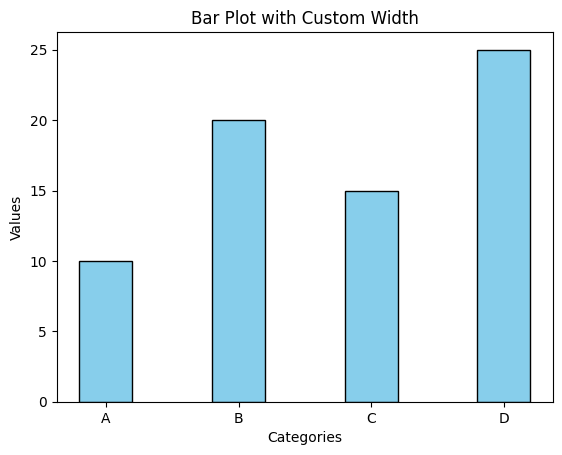
Let's start by creating a simple bar plot with a customized width.
import matplotlib.pyplot as plt

# Data for the bar plot
categories = ['A', 'B', 'C', 'D']
values = [10, 20, 15, 25]

# Create bar plot with custom width
plt.bar(categories, values, width=0.4, color='skyblue', edgecolor='black')

# Add labels and title
plt.xlabel('Categories')
plt.ylabel('Values')
plt.title('Bar Plot with Custom Width')

# Show the plot
plt.show()
Explanation
- The
widthparameter is set to 0.4, reducing the default bar width. - Additional parameters like
colorandedgecolorare used for aesthetics. - The smaller bar width enhances the separation between bars, making the plot easier to read.

Example 2: Grouped Bar Plot with Adjusted Width
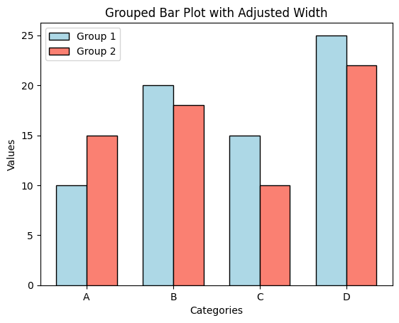
When plotting grouped bar plots, adjusting the bar width helps in maintaining clarity between groups.
import matplotlib.pyplot as plt
import numpy as np

# Data for the grouped bar plot
categories = ['A', 'B', 'C', 'D']
values1 = [10, 20, 15, 25]
values2 = [15, 18, 10, 22]
x = np.arange(len(categories))

# Bar width
width = 0.35

# Create grouped bar plot
plt.bar(x - width/2, values1, width=width, label='Group 1', color='lightblue', edgecolor='black')
plt.bar(x + width/2, values2, width=width, label='Group 2', color='salmon', edgecolor='black')

# Add labels, title, and legend
plt.xlabel('Categories')
plt.ylabel('Values')
plt.title('Grouped Bar Plot with Adjusted Width')
plt.xticks(ticks=x, labels=categories)
plt.legend()

# Show the plot
plt.show()
Explanation
- Two groups of bars are plotted with their x-coordinates shifted by half the bar width.
- The
widthparameter ensures that the bars are appropriately sized for grouping. np.arangeis used to calculate the x-coordinates for the bars.

Example 3: Adjusting Bar Width for Overlapping Bars
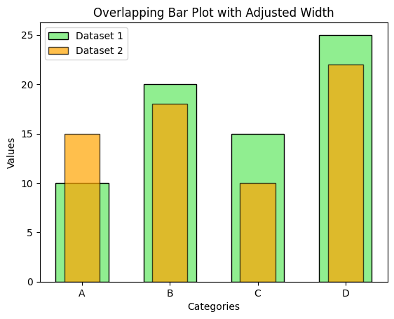
In cases where bar plots are overlapping, adjusting the bar width can help differentiate the data.
import matplotlib.pyplot as plt

# Data for the overlapping bar plot
categories = ['A', 'B', 'C', 'D']
values1 = [10, 20, 15, 25]
values2 = [15, 18, 10, 22]

# Create overlapping bar plot with reduced width
plt.bar(categories, values1, width=0.6, label='Dataset 1', color='lightgreen', edgecolor='black')
plt.bar(categories, values2, width=0.4, label='Dataset 2', color='orange', edgecolor='black', alpha=0.7)

# Add labels, title, and legend
plt.xlabel('Categories')
plt.ylabel('Values')
plt.title('Overlapping Bar Plot with Adjusted Width')
plt.legend()

# Show the plot
plt.show()
Explanation
- The first dataset uses a bar width of 0.6, while the second dataset uses 0.4 for overlap adjustment.
alphais used to make the bars semi-transparent, improving readability.- This technique is helpful when datasets share the same x-axis categories.

Summary
In this tutorial, we covered:
- How to customize the width of bars in a bar plot using the
widthparameter. - Adjusting bar widths in grouped bar plots to avoid overlap and improve readability.
- Using different bar widths for overlapping bar plots to distinguish datasets.