Python Matplotlib - Bar Plot Border Width and Color
Python Matplotlib - Bar Plot Border Width and Color
Customizing bar plot borders can significantly enhance the visual appeal and clarity of your data visualization. Python's Matplotlib library allows you to adjust the width and color of bar borders easily. This tutorial will guide you through:
- Adding and customizing border color for bar plots.
- Adjusting the border width of bar plots.
- Combining border customization with other plot styles.
Adding Borders to a Bar Plot
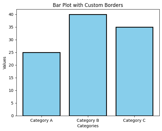
The edgecolor parameter in plt.bar() is used to set the border color, and linewidth adjusts the border thickness.
Example 1: Basic Border Customization
import matplotlib.pyplot as plt

# Data for the bar plot
categories = ['Category A', 'Category B', 'Category C']
values = [25, 40, 35]

# Create the bar plot with borders
plt.bar(categories, values, color='skyblue', edgecolor='black', linewidth=2)

# Add labels and title
plt.xlabel('Categories')
plt.ylabel('Values')
plt.title('Bar Plot with Custom Borders')

# Show the plot
plt.show()
Explanation
- The
edgecolor='black'parameter specifies the color of the bar borders. - The
linewidth=2parameter increases the thickness of the borders for better visibility. - Other visual elements like labels and titles enhance readability.

Customizing Borders for Individual Bars
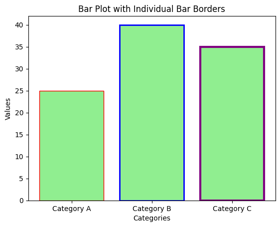
You can set different border colors and widths for each bar by passing lists to the edgecolor and linewidth parameters.
Example 2: Individual Bar Border Customization
import matplotlib.pyplot as plt

# Data for the bar plot
categories = ['Category A', 'Category B', 'Category C']
values = [25, 40, 35]

# Create the bar plot with customized borders for each bar
plt.bar(categories, values, color='lightgreen',
        edgecolor=['red', 'blue', 'purple'],
        linewidth=[1, 2, 3])

# Add labels and title
plt.xlabel('Categories')
plt.ylabel('Values')
plt.title('Bar Plot with Individual Bar Borders')

# Show the plot
plt.show()
Explanation
- Lists are passed to
edgecolorandlinewidthto apply unique styles to each bar. - This approach allows you to emphasize specific bars in your plot.
- The bar colors and other plot elements are customized for enhanced visualization.

Combining Borders with Gradient Colors
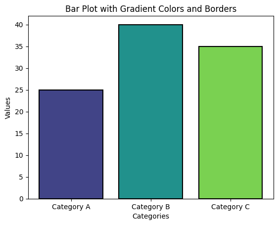
Matplotlib does not support gradients directly, but you can use color maps to achieve gradient effects. Borders can be applied alongside gradients.
Example 3: Bar Plot with Gradient Colors and Borders
import matplotlib.pyplot as plt
import numpy as np

# Data for the bar plot
categories = ['Category A', 'Category B', 'Category C']
values = [25, 40, 35]

# Generate gradient colors using a color map
colors = plt.cm.viridis(np.linspace(0.2, 0.8, len(values)))

# Create the bar plot with gradient colors and borders
plt.bar(categories, values, color=colors, edgecolor='black', linewidth=1.5)

# Add labels and title
plt.xlabel('Categories')
plt.ylabel('Values')
plt.title('Bar Plot with Gradient Colors and Borders')

# Show the plot
plt.show()
Explanation
- Gradient colors are created using the
viridiscolormap from Matplotlib. - The
edgecolor='black'andlinewidth=1.5parameters apply uniform borders to all bars. - Gradient colors and borders together enhance the aesthetic appeal of the plot.

Summary
In this tutorial, we explored:
- How to add and customize bar plot borders in Matplotlib.
- Customizing borders for individual bars with unique colors and widths.
- Combining borders with gradient colors for visually appealing plots.
Customizing bar plot borders adds clarity and style to your visualizations, helping you highlight important data points effectively.